Behind the Scenes: Psysquatch
In Search of Monster (placeholder)
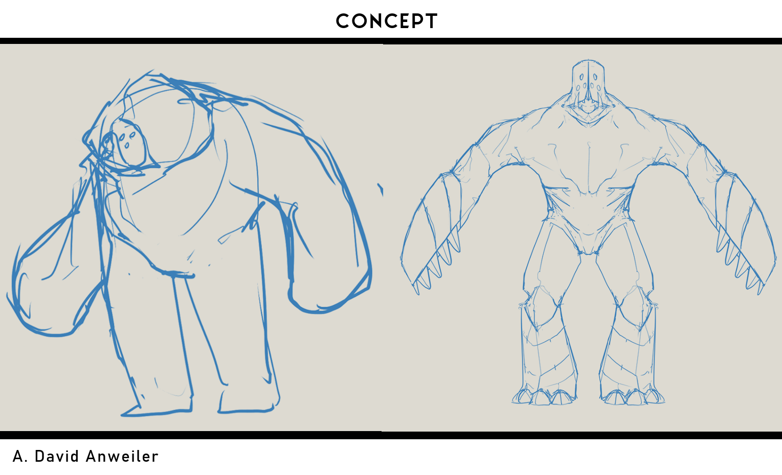
Monster Concept Art Credits
A. David Anweiler
Psysquatch is a reptilian big foot, psionic-based life form. Below is the thrilling account of how it clawed their way out of our minds and into the heart of our game. A kaiju scale cryptid roaming the Second Great Dust Bowl.
The pitch on this game was a road trip but in a mecha, interrupted by a cryptid sighting but at the scale of a kaiju. This combat encounter was inspired by the myth of the Jersey Devil, haunting weary travelers in the Jersey Pine Barrens. Our design eventually came into focus on the most archetypal cryptid: Big Foot.
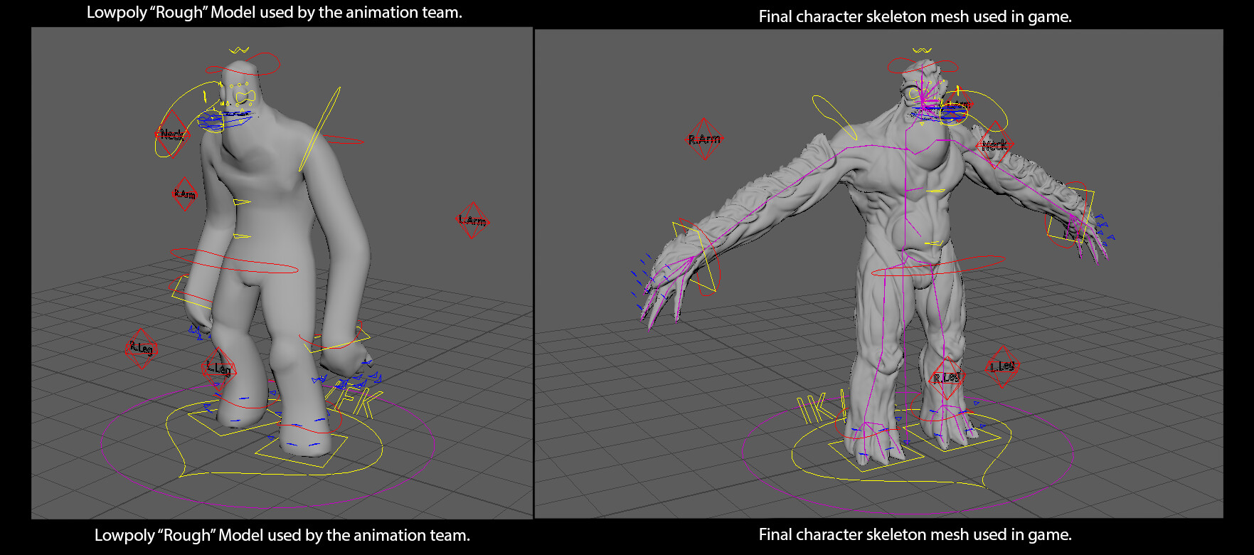
Ironically for me and appropriately for David our education came from classic 2D animation. I always enjoy using classic concepts to strengthen 3D designs. So our monster is made of solid cylinders and triangles. During the concepting phase we went back and forth as to how human to make our monster. In talking with fellow monster enthusiast and collaborator Marisa Gehrig we decided to use traditional Kaiju men in suits as inspiration. We didn't want the allusion to be as upfront as ACE Team's "Tower of Deadly Monsters," but instead we used it as a buoying guideline to aid in production. The monster is an anatomical composite of sumo wrestler, lizard, rhino, orangutan, and frog. They began as a very basic model that matched the concept silhouette. This allowed our animation department to work independently and alongside me as I worked on the sculpt.
I collaborated with our narrative lead Taylor Andrews and sound designer Damion Rowe to sketch out a back story for the monster. Unfortunately plot had to be all but exercised from the game due to time constraints. Luckily it can be revealed here as an EXCLUSIVE. The monster naturally lives on the surface of the sun within the radiowave electromagnetic spectrum. When the gas crisis tore a hole in the atmosphere it created a vacuum that pulled the monster through the rays of the sun down to the earth. The monster ionizes the air, creating an overwhelming smell of pennies that precedes their presence. The monster is not naturally hostile but will destroy you if provoked. The secret ending, which did make it into the game, allows you to free the monster by destroying the power lines that ensnared it. The Monster's name was inspired by Mastodon's Cyclopes-Sasquatch portmanteau in the song "Circle of Cycsquatch". The monster, Psysquatch, is an extracelestial psionic-based organism.
On Top of the Skin
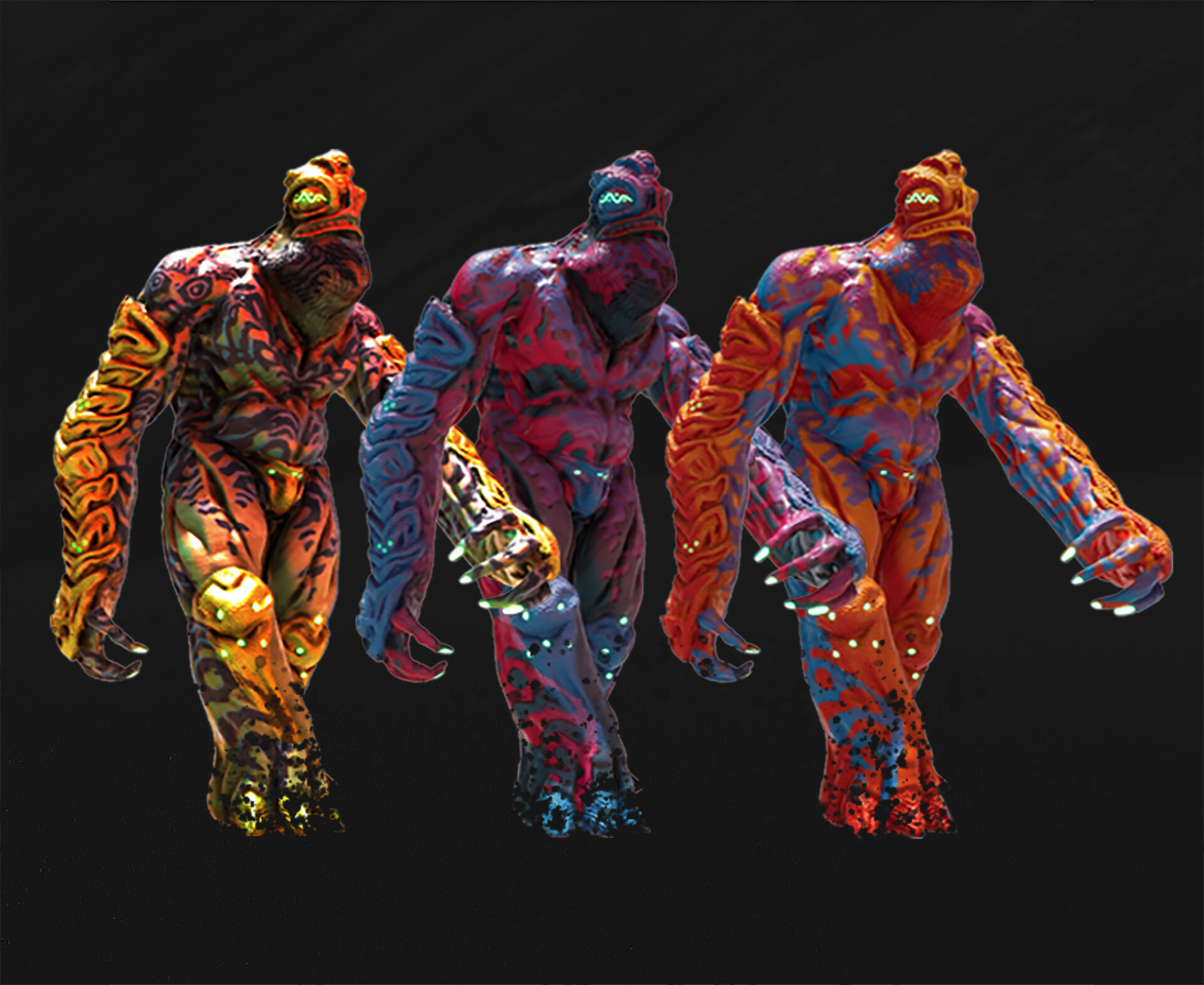
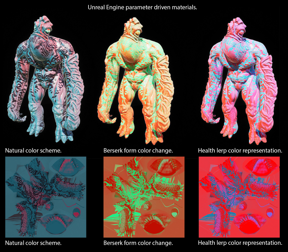
Vibrant color gradients was a consistent aesthetic of the game, inspired by prints made by Pascal Blanché. For the monster coloring I worked with Coloring Consultant Leah Nobel on picking a compelling palette. The monster needed to stand out from the rustic tones of the desert environment and create interesting gradients. The textures were painted in by a dot-product that calculated the source of sunlight to create this effect through Material Blueprint. The skin pattern was created by photo-bashing Chris Foss' concept art for Dune together with gila monster scales and turtle shells. The pattern became an important signal to the player for the monster's behavior. The texture was created as a greyscale in Substance Painter. The greyscale texture base was modified by material parameters at runtime. These different color sets informed the player of the Monster's behavior in the fight.
In an effort to avoid graphical interface elements we forwent a traditional boss health bar. Instead the sun sets in response to how much health the monster has. As the sun sets the angle of the color gradient that paints in the monster changes. Additionally the colors used, from a muted red and blues under the light of high noon at full health to vibrating turquoise and magenta that sear through the settling night.
Making a Monster
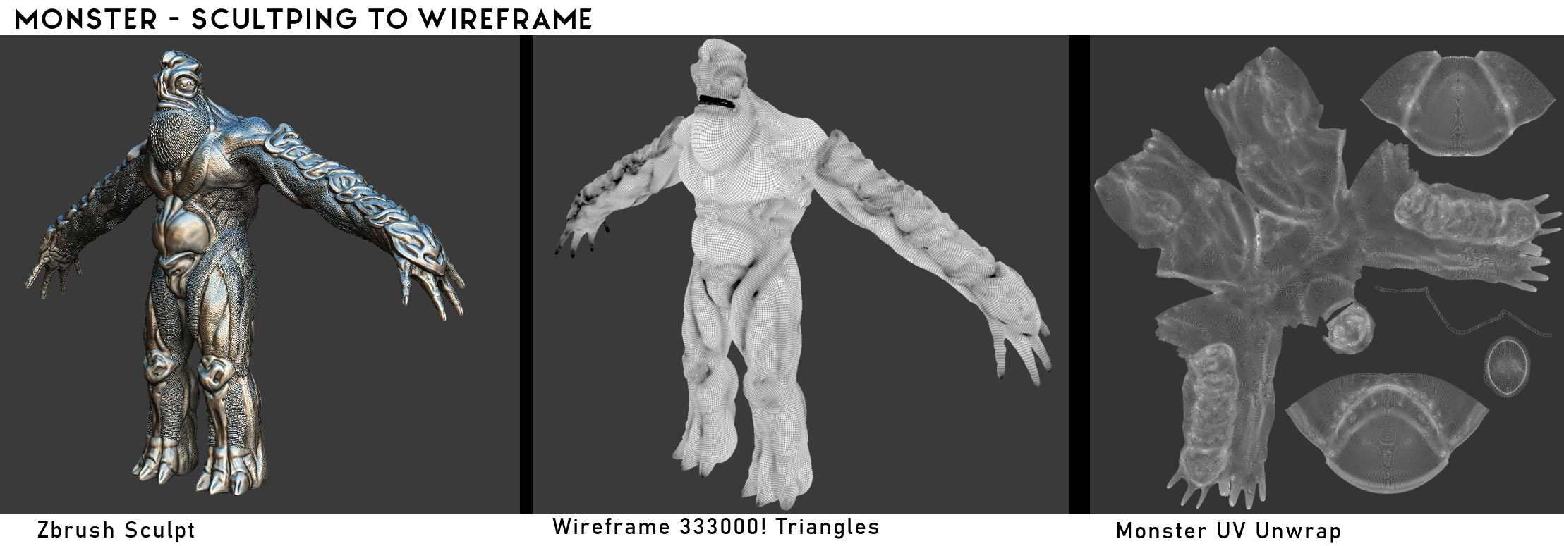
This was my first chance to complete a character sculpt and move it down a pipeline. This opportunity to explore anatomy and 3D sculpting tools was one of the facets I was most excited about in planning this project. An obvious glaring flaw, looking over the end results: that triangle count is WAY to HIGH. Because we had so few actors the monster in particular was allowed an extravagant part of our polycount budget. In sculpting the monster I explored exaggerating anatomy and filling in details that we didn't explore in the concept art. The thick bands of defined muscle were inspired by the rubber in the original Godzilla suit. The scales are detailed in multiple layers. A surface pass on the sculpt mimicked the skin of a Gila monster over the dense musculature. Then a layer of of scales brushed onto the sculpt. On top is a layer of separate geometry from nanomesh. I groomed several different shapes of scales to mimic the feel of hairs. To help connect the creature back to their Bigfoot root. My favorite aspect of the sculpt were the armor plates. In gameplay these were important to communicate the defensive capabilities of the monster when guarding in combat. These armor plates were inspired by turtle shells but were mostly inspired by exploring abstract shapes in ceramic's class.
Thanks to My Instructors
Eric Carlson and Matt White for critique and guidance in sculpting the monster.
On the Face of Monsters
Combat involved getting all up in the monster's face, so it needed to be fun to punch. Our initial concept was a trio of eyes and a mouth full of horns on a soda can head. As development progressed the eyes became wavy lines to make the face even more alien. These weird visual sensors also connected to the monster's background narrative and harmonized with the visual of the oscillator in the mech. The triple circle symbol was retained as bur holes in the thick bones on the monster's armor.

But the mouth was still full of spindly horns, like dentures made from goat horns. This started causing problems with the animation rig. It was a lot to fit inside the head and would clip through even in test animations. Visually we were also causing an "Akroan Lion" problem. Mark Rosewater, head designer on Magic: The Gathering describes changing too much for the sake of creativity eventually alienates the audience and should be worth explaining. When browsing Robbie Trevino's art I realizes that an unsettling grin can be far more effective than snarling teeth. I flashed-back to early disquieting art on the "Ojama" Yu-Gi-Oh cards and fashioned our monster a pair of big chompers. Whittling our "Akroan Lion" back into a Trojan Horse.
Last was the lips. In reading Chris Plante's coverage of Rage 2 I realized we too were using an exaggerated cleft palette as a shorthand for monstrous. So I took to finding a fix for this mistake. I Incorporated the fleshy nose of a fruit bat, instead of a cleft lip. The shape of the mouth with the eyes became a star like silhouette, a sly reference to "Star Man" from NES Pro-Wrestling an inspiration for the arcade flavor to the combat. With an additional layer of lizard ridges I strangely had to navigate "Shape of Water" allusions that made the monster look more like "The Amazon" fish man. Now the monster has a face worth punching.
Thus concludes the narrative of sculpting the monster head.
Sculpt, Texture, and Rig Credits
Andrew Jacobs
Monster In Motion
Our school's entire animation department had a chance to help animate on this project. The department head, Matt White gave the final dash of flavor to the monster. He animated the idle stance of the monster with an undulating breath cycle like a big old toad. I doubled down on this by making the neck more bulbous and layering on frog musculature over the standard sapiens anatomy. Their arms were meant to move like big wet noddles, or as our animators took it: long sweater sleeves. To capture the feel of a man in a suit the monster's animations started as rotoscope over live action reference footage. We were fortunate enough to get some animation review from our Alumni, Chris McCormick animator at Blizzard.
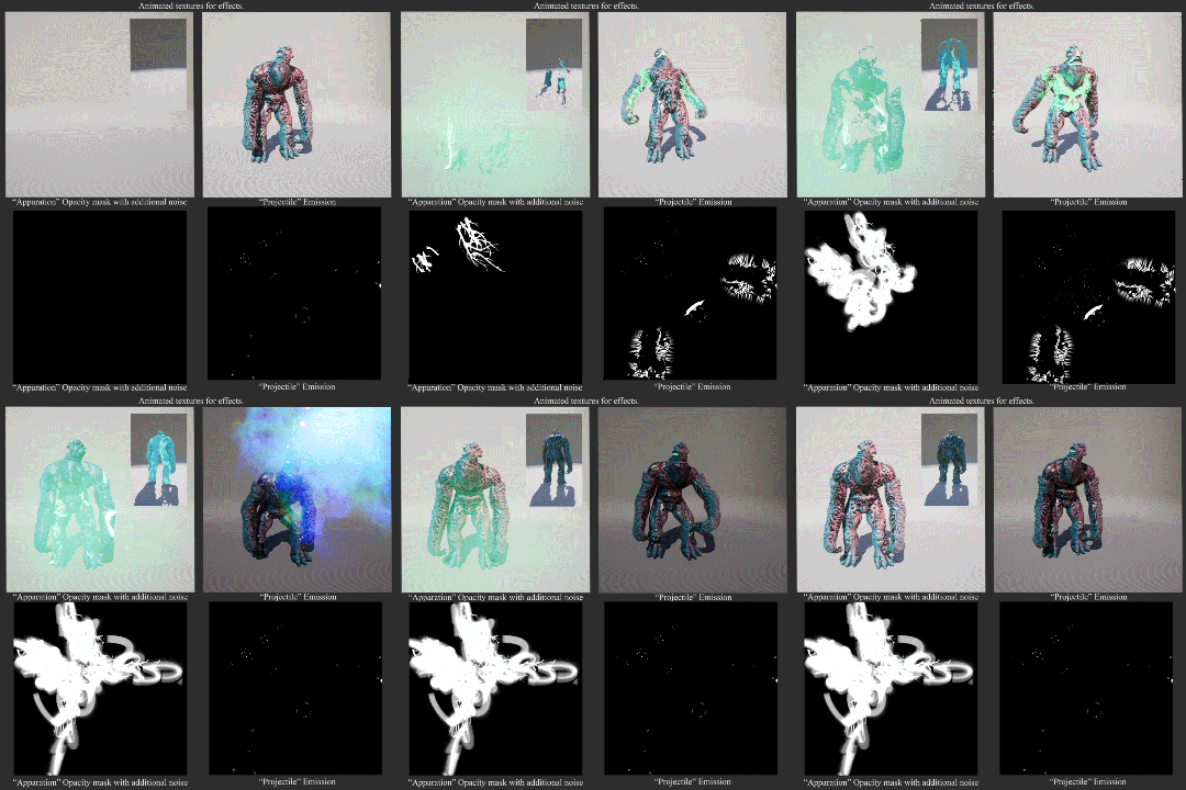
The monster naturally lives within the radiowave range of the electromagnetic spectrum. He transitions back and forth to visible plain through this effect. As an allusion to big foot disappearing in the woods part of this effect is branches growing to fill in the silhouette. On top of this is is a waveform generated from Mastodon's Circle of Cycquatch.
Monster Animation Credits
Abby Chavis, Fiona Fallon, Jennifer Martin, Matt White, Emily Lane, Emily Misner, Eddie Machado, Sydney Sylvester
Battle Behaviour
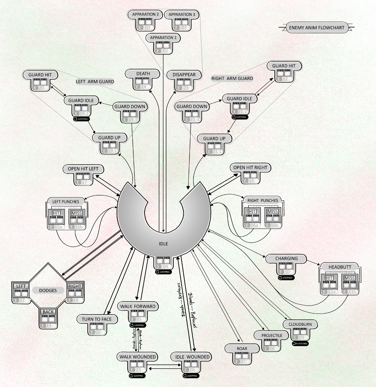
The monster's AI Behaviour was the the biggest struggle to wrangle. Combat design was tied to a tension between close quarters and at range attacks. This paradigm was inspired by the puzzle-combat of "Punch-Out!", extrapolated into 3D. The monster reacts to left and right side punches with armored blocks that punish spamming attacks. Dodge moves respond to mix ups and allow the monster to retaliate with their own melee swipes. Chunks of damage close up cause the monster to summon a damaging cloud of fire, forcing the player to retreat. This prompts the player to reengage either by driving and crashing back into the monster or shooting their missile attacks. These from range attacks charge up the monster's ability to unleash their own projectile. If the player is dominating the monster it is able to enter a berserk state. This was intended to "rubber band" the combat like a race in Mario Kart. The tension of combat exists in close damage values, this was intended to keep combat interesting within a span of player ability.
End
Get Deusimator
Deusimator
A mech powered road trip though big foot country.
| Status | Released |
| Author | ajacobs.q |
| Genre | Action, Fighting, Simulation |
| Tags | 3D, Arcade, First-Person, Mechs, Monsters, psychedelic, Singleplayer, Unreal Engine |
More posts
- Behind the Scenes: Automo-MechaNov 08, 2019
- Behind the Scenes: ArtSep 19, 2019
- Credit SequenceMay 28, 2019
Leave a comment
Log in with itch.io to leave a comment.