Behind the Scenes: Automo-Mecha
Giant Robot
Big Body Automo-Mecha Super Hugger '76
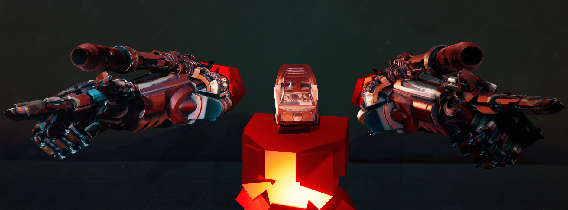
Since it's release Deusimator has drawn a lot of comparison's with 2004 era Cartoon Network show Megas XLR. Which is fair - because it fundamentally is - but Megas never had a proper video game and that always bothered me. Though in the fiction of our game mechs from a significantly different place. Imagined in one those "alternate retro-futures," the oil crisis of 197X lead the world to invest in an alternative energy source. Energy which fueled enormous engines, so large and powerful they required massive machines to carry and breath life into. Automo-Mechs were born out of the cradles of the American Automotive Industry. Which caused a domino effect of lore and mythos that formed the world our game is set in. The Big Body Super Huger mech was designed for arduous treks through the Second Great Dust Bowl that swallowed the center of the continent.
In contrast to the long and lanky Psysquatch monster, our giant robot was squat and stout. As an analog to the human body our mechs were more like gorillas. Built out of American Muscle Cars and Long Haul Semi-trucks, the cinematic backbone of a long road trip through those nowhere places in the United States. The full experience of this title was imaged as languid journey in Jalopy inhabited in the hefty thrill of MechWarrior, with a car / mech hybrid at it's center.
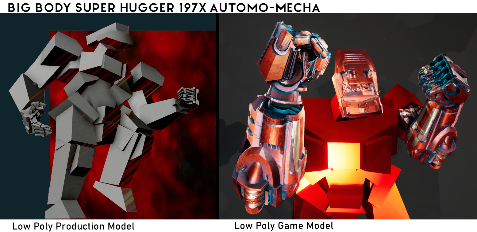
As with most things, a lot of reference inspired the design of this particular giant robot. What follows is a summary of every thought that went into making our mecha. Mattel's "Rock 'Em Sock "Em Robots" from 1964 was a physical analog to our video game concept . This classic toy tied to the retro-futuristic aesthetic. The simple molds of the toy served as restraints on the complexity of the mech's designs which helped speed production and enforced strong simple shapes to make the character. The I-beams in the wrist on the arms were a direct reference to the original "Rock 'Em Sock 'Em" toys.
The arm cannons are covered by hoods that were lifted from various hot rod builds. These of course were connected to the automobile routes of our mechs in the fiction. Which extended to the cannons themselves which are a bash together of an engine block and exhaust pipes with Gatling gun parts. There is also an ashtray in there as a tribute to my father and his classic Camero. The rotary element of the cannons were decorated with horse decals from Eadweard Muybridge's galloping horse from 1878. If you look closely while firing the guns you can see the horse gallop through the view port like a traditional zoetrope.
Graphic designer Doug Jones has been consistent inspiration for his freshened up Art Deco illustrations. His 1984 cover to Judas Priest's album "Defenders of the Faith," the Metallian in particular. The band's pantheon of characters were a general inspiration for their fantastical machinery. The faux musculature elements of the mech were referenced from this material.
Probably shouldn't talk about mechs for this long without getting into anime. Mobile Suit Gundam: Iron-Blooded Orphan's menagerie of mechs were in constant rotation when building out our own giant robot. Looking at the gunpla Barbatos was a help for understanding how the geometry of the joints would fit together for all the moving pieces. Custom paint jobs on gunpla additionally informed the texture layer. We intentionally avoided Transformers in our reference material as to not confuse the intent of our mech as cars concept. If I had the time to model the entire robot it would have taken a lot of cues from the skeletons of IBO's mechs. As our game was experienced entirely in first person the most effort went into the arms and head.

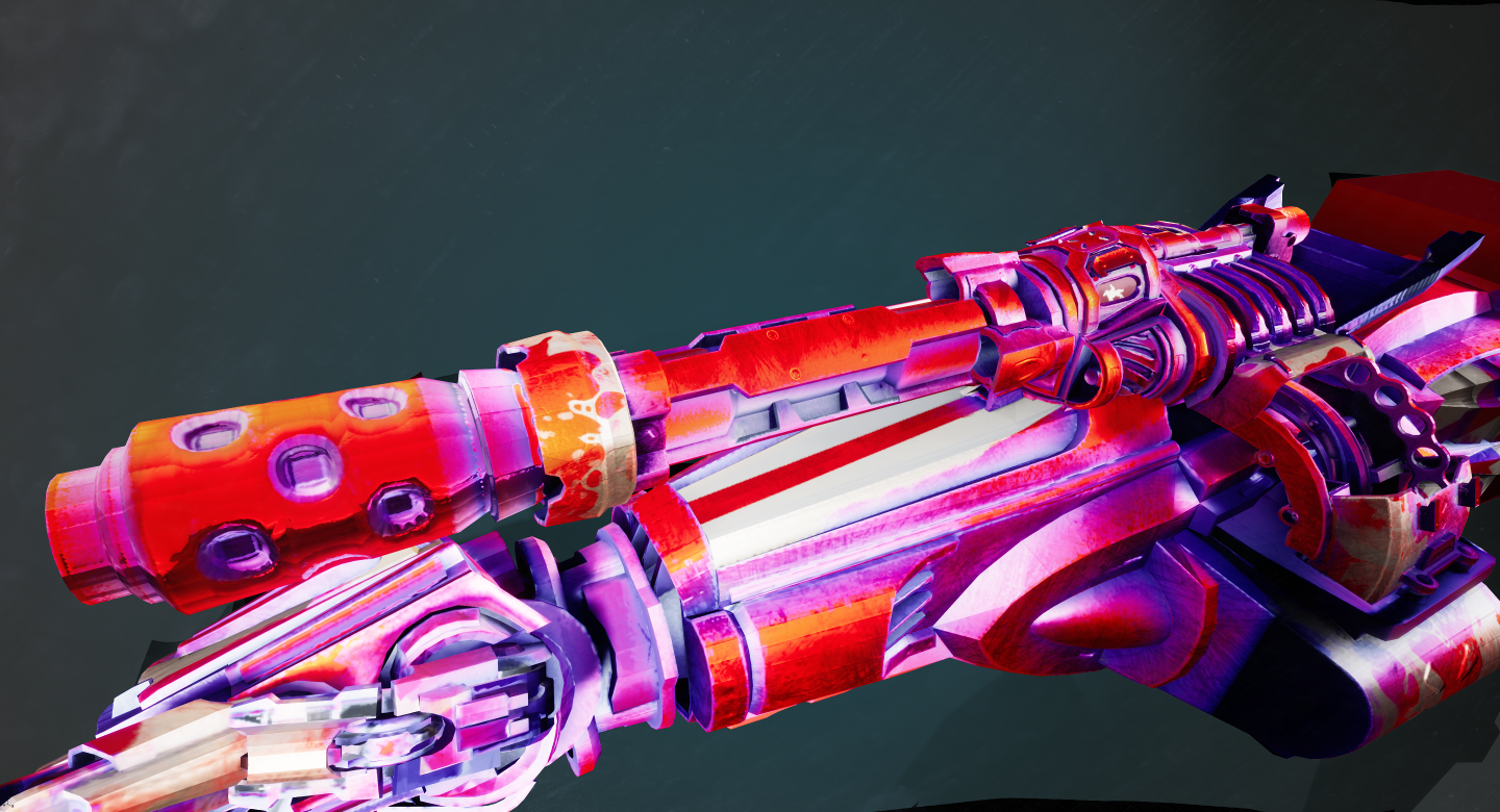
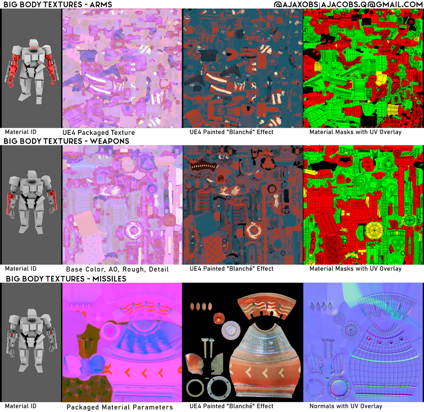
For the textures we used the same technique as every surface in the game. A grey scale texture was made to illustrate surface details. This texture was painted through a material blueprint that calculated the dot-product relation of the sun to the mech. The simulated sunbeam painted light and shadows as separate color fills in the texture. This effect is most easily notable on the mech, since the player is in control of where they are in relation to the sun. This was amplified with the ambient occlusion to create more diverse color gradients. On the mech arms the AO was baked with the pieces all together rather than exploded out as they should have been, causing errant shadows that don't make sense when the pieces move. A geometry smoothing mistake plagues the normal maps, creating harsh edges on what should be round surface. The missile's should have been combined with the cannon weapon UV space to not waste texture memory and texel density like I did.
Model, Sculpt, Texture, and Rig Credits
Andrew Jacobs
Physicality
Over the course of development I learned to think about mech as more than cool robots. To start thinking about their meaning in fiction and how that played with the themes of our game. During development the re-release of Neon Genesis Evangelion was announced and the preview cycle of Daemon X Machina was at its height. The discourse around those properties helped put mechs in a context that I lacked during pre-production. The work of Austin Walker was essential in navigating what it means to build and inhabit giant human bodies, machines "that look like us." Heather Alexandra's writing, particular her preview of the beta release of Daemon X Machine had a profound impact on this project. I saw her criticism of the game's lack of physicality reflected in what I was working on, which ironically was one of our principle goals. To highlight the physicality of our mech I made damage for our giant human.
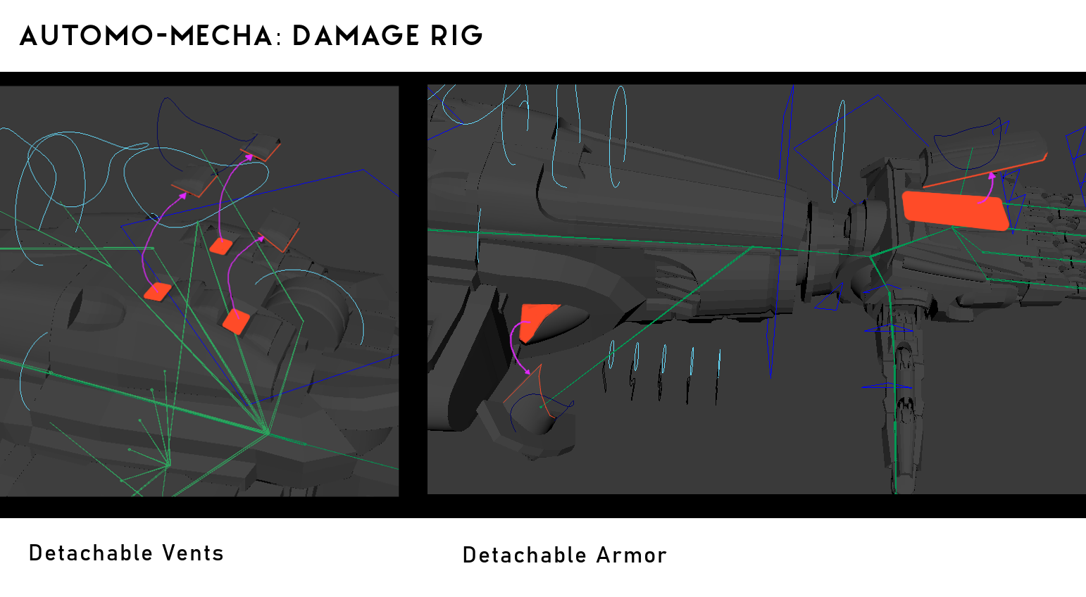
One night, after a successful milestone review, rather than head home early I took that night to add damage to the mech. I separated off pieces of the mesh, created breakable chunks. Which required some rearranging on the UV Layout for the textures. I added onto the rig additional joints that would animate those pieces when they were broken off the mesh. These pieces would pop off and fall to the feet of the mech, then scale down to almost nothing when broken in game play.
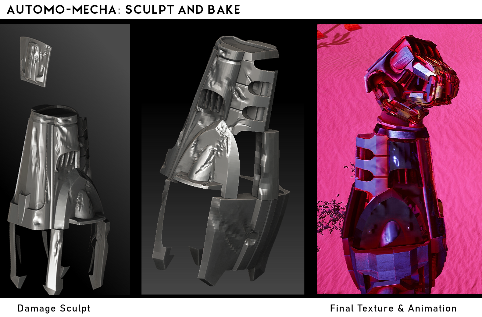
I sculpted a dented and torn version of the arm for additional details. These were made from key pieces of the original mesh. The sculpt was baked separately, with additional painting, to create damaged textures. The textures were then masked off to show different levels of damage across both arms with the same texture sheet.
The 3D damage and 2D damage are applied in increments as the mech's health decreases. The layers of damage ping pong from left to right on the arms. This helps obscure the symmetry of the the assets and to make it feel like damage is applied with visual balance.
Get the Mech on Movin'
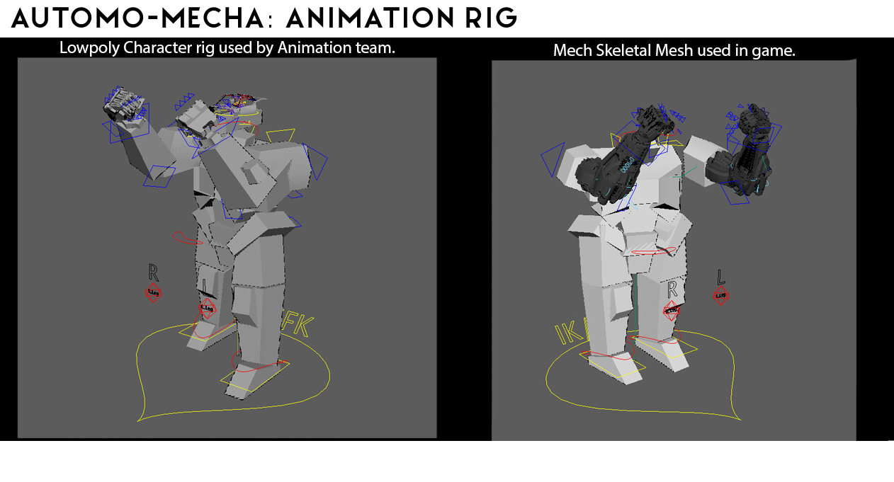
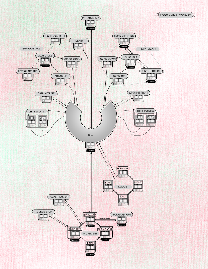
The mecha is the extended body of our player in the world. The strongest loop of game play in that world was combat. Ureh Magus, was our dedicated mech animator. His experience with martial arts was important in crafting a believable fighting style for the mecha. We decided on a boxer, to connect with the "American Muscle Car" inspirations in the mecha design. For professional reference Destiny's animation was a huge touch stone to make combat "feel good" by looking at movement on a screen. Additional reference from Overwatch's animation and some guidance from our school's alumni, Chris McCormick, Blizzard animator. Lastly ever since it's release, the ethos of DOOM has been a goal for my combat design and a benchmark for my understanding of games. Incite from its creators helped squeeze every once of game play we were able to animate into motion. All this reference for method helped bring into focus what we needed from our animations. To make the mech feel good to drive around, shoot missiles, and punch at our monster.
The arms were given the most attention in animation, since the player's perspective was in first person. The remainder of the body was animated to generate good shadows from the mecha in game, resonating with our goals for physicality from the robot. This extra animation also helped our sound designer in understanding the sounds we needed to convey movement outside of the player's view.
Animation Credits
Ureh Magus, Andrew Jacobs
Weapons on War Machines
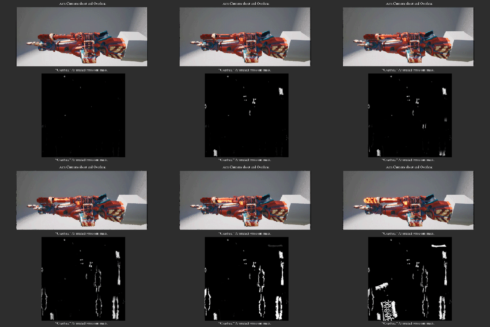
One of my most anticipated asset to work on were the mecha's weaponry. While most animation work was delegated to our animation team, I took ownership over animating the cannons. In the early prototype phase finger guns were used to show the mecha shooting. This made it into the final project to add some levity to the shooting. Which connected to the initial silliness of inspirations such as "Surgeon Simulator" and "Jalopy." The cannons spin from the power of the mecha's engines. The more speed the player keeps y driving the mecha the faster they can shoot, powered by a foot on the gas rather than a pull of the trigger. The cannons heat up with emission masks that were animated in After Effects and additional particle steam in Unreal as the cannons are fired. This was referenced from footage of machine guns firing until the bullets exploded through the molten end of their barrels.
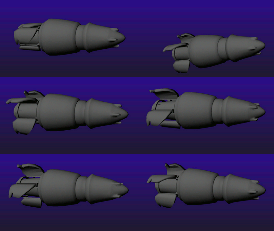
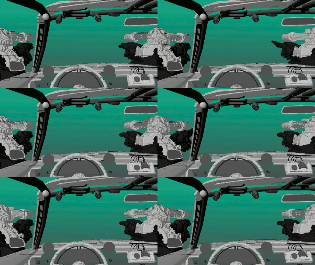
The cannons launch missiles. We wanted hard shell ballistics rather than futuristic laser beams. In game the projectiles were also used to calculate impacts by collision volumes rather than hit scan. Which connected to the physicality we were intending to communicate with the giant robot. The belt fed guns made the animation for the missiles going into the cannons tricky. They wind around in a circle until the ammo count winds down to zero then their visibility is switched off. As the player reloads the same function works in reverse to put missiles back in the cannons. When the missiles are shot they travel within a range that arcs back to the spot the player is aiming at. The missiles then have their own animation that mimics the "drunken" missiles from anime - even though they don't have the same cluster and seek function. The personality was important to make the cannons fun to shoot.
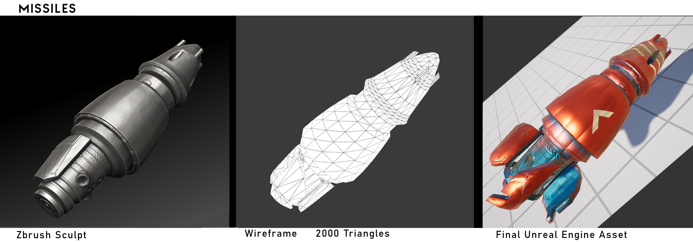
The missiles were based on atomic warheads merged with toy missiles from Optimus Primal as giant magnum bullets. My ceramics instructor Eric Carlson was a great help in creating these missiles as their own piece of art. His sculpted war ordnance served as inspiration to make even the details on these small props special.
As game play assets the missiles were an extravagant use of polygon count and texture memory. Originally they were surfaced with full PBR materials. The missiles fly by at enough speed that the player can't even appreciate their detail. The geometry on the missiles also had poor smoothing, creating harsh edges on the surface. So the spawned projectiles were given basic solid materials. The missiles that loaded into the cannons kept their material since they were so close to the camera. Even though they were a small piece, the missiles were a big learning experience.
END
Get Deusimator
Deusimator
A mech powered road trip though big foot country.
| Status | Released |
| Author | ajacobs.q |
| Genre | Action, Fighting, Simulation |
| Tags | 3D, Arcade, First-Person, Mechs, Monsters, psychedelic, Singleplayer, Unreal Engine |
More posts
- Behind the Scenes: PsysquatchSep 24, 2019
- Behind the Scenes: ArtSep 19, 2019
- Credit SequenceMay 28, 2019


Leave a comment
Log in with itch.io to leave a comment.